For the first time ever, Pantone has chosen two colours for 2016; Rose Quartz, a warm pastel pink, and Serenity, a soft tranquil blue. Rose Quartz and Serenity were chosen by Pantone this year as an antidote to modern day stresses. Married together, they are a romantic blend, reflecting wellness, balance, and connection.
This palette theme lends itself well to the home – think soft base tones of blue and grey, accented with decorative elements of pink and purple, to bring a relaxing sense of order and tranquility to otherwise chaotic living spaces.
In decades past, these candyfloss hues would typically be assigned to the walls of a nursery, but Pantone explains how the free flowing exchange of information online today has “opened our eyes to different approaches of colour usage”. And while the balminess of Rose Quartz, and the calmness of Serenity are still perfectly suited to bedrooms, these pigments can be used to create stunning effects in other areas of the home, especially in rooms where there is often a lot going on, such as the kitchen and/or living space.
Taking a playful approach to DIY is key for this trend. The shades will inject unexpected freshness to simple white or grey spaces, or work as a comforting alternative to more traditional neutrals. That said, refreshing your interior design to incorporate the Pantone colours of 2016 doesn’t mean a total overhaul of existing spaces or furnishings is required. Here we look at some subtle ways to introduce the most on-trend colours of this year into your home in an easy, hassle-free way.
These colours will totally rejuvenate spaces which often feature crisp, all white décor, such as the kitchen. Rather than replacing all of your more permanent appliances and workspaces with current colour trends – which could be suffocating and end up looking dated in a relatively short time – a better approach is to inject small bursts of colour using accessories.
Stack small ceramic bowls and crockery upon open shelving, add in some whimsical ornaments, and hang utensils from pretty pegs to transform storage spaces. Storage jars filled with sweets make a lovely finishing touch, and investing in some smaller appliances will offer a real wow-factor.
The ‘shaker’ style kitchen has long been a staple favourite, and Pantone 2016 colours can easily be entwined into this design. If you’re feeling bold, a retro diner or ice cream parlour style kitchen can make impressive use of these sweet pastel hues. Soft colours pair well with deep, dark shades like charcoal or grey, as well as the metallic tones of pans, appliances and joinery accents, making them a particularly versatile addition to any kitchen space.
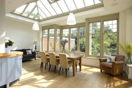
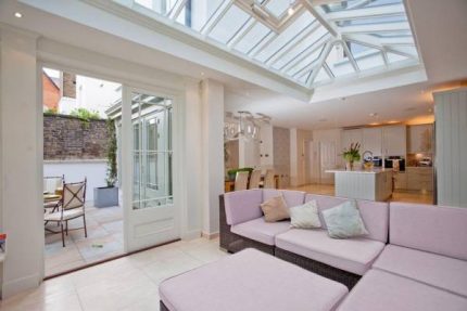
In a light, airy living space especially, such as an orangery or garden room, Rose Quartz and Serenity will retain the light, breezy look and feel of the area. If you’re feeling particularly bold, these colours can be used for larger furnishings such a sofa or other seating, without overpowering the room.
For a more minimalist appearance, opt for elements of colour in smaller furnishings and accessories such as vases, storage trunks, rugs, throws and cushions to instantly revive the room’s design at a relatively low cost.
If you’re feeling crafty, use the Pantone colours to inspire a DIY project, for example a shabby-chic style repaint of wooden stools, chairs, cabinets or photo frames will add fun and colourful character to any living space – and is easy to change as new trends emerge.
The combination of these fresh pastel shades evokes daydreamy senses, which can be emphasized further by careful consideration of fabrics and furnishings to complement the balanced colour spectrum. Dress windows with lightweight linen or organza to accentuate the radiance and luminosity of the colours. Devine velvets, crisp satins, deep pile fibres, and brushed cottons work well by providing luxurious accompanying textures.
We expect Rose Quartz and Serenity to be included into the colour schemes of many homes when redecorating in 2016, partly attributed to the unwavering popularity toward grey as a neutral base in contemporary interior design. As the grey palette offers both warm and cool tones, there are shades which will suit the warmer pink shade and others which will pair well with the coolness of the pale blue.


